Special A
/=
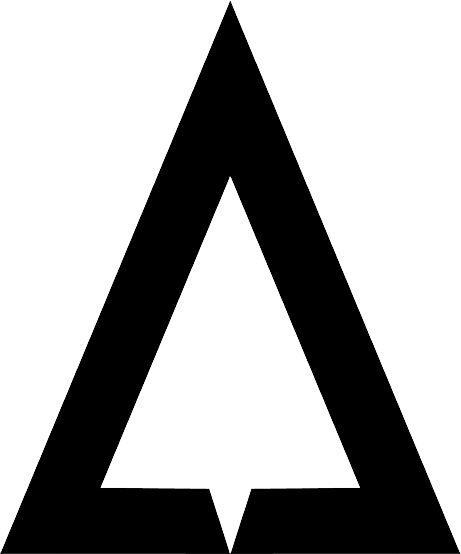
People who have visited us previously, may have noticed we underwent a major branding revamp of our website and logo.
Quite A Change
For our new logo, we had a few design objectives to be met:
1) Firstly, to update our logo with a simple, modern and memorable design.
2) Communicate our strength as a tech company.
Sub objectives:
a) Design and colors that lend itself to adaptability to wherever it might be placed.
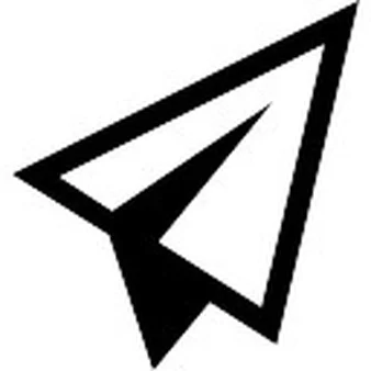
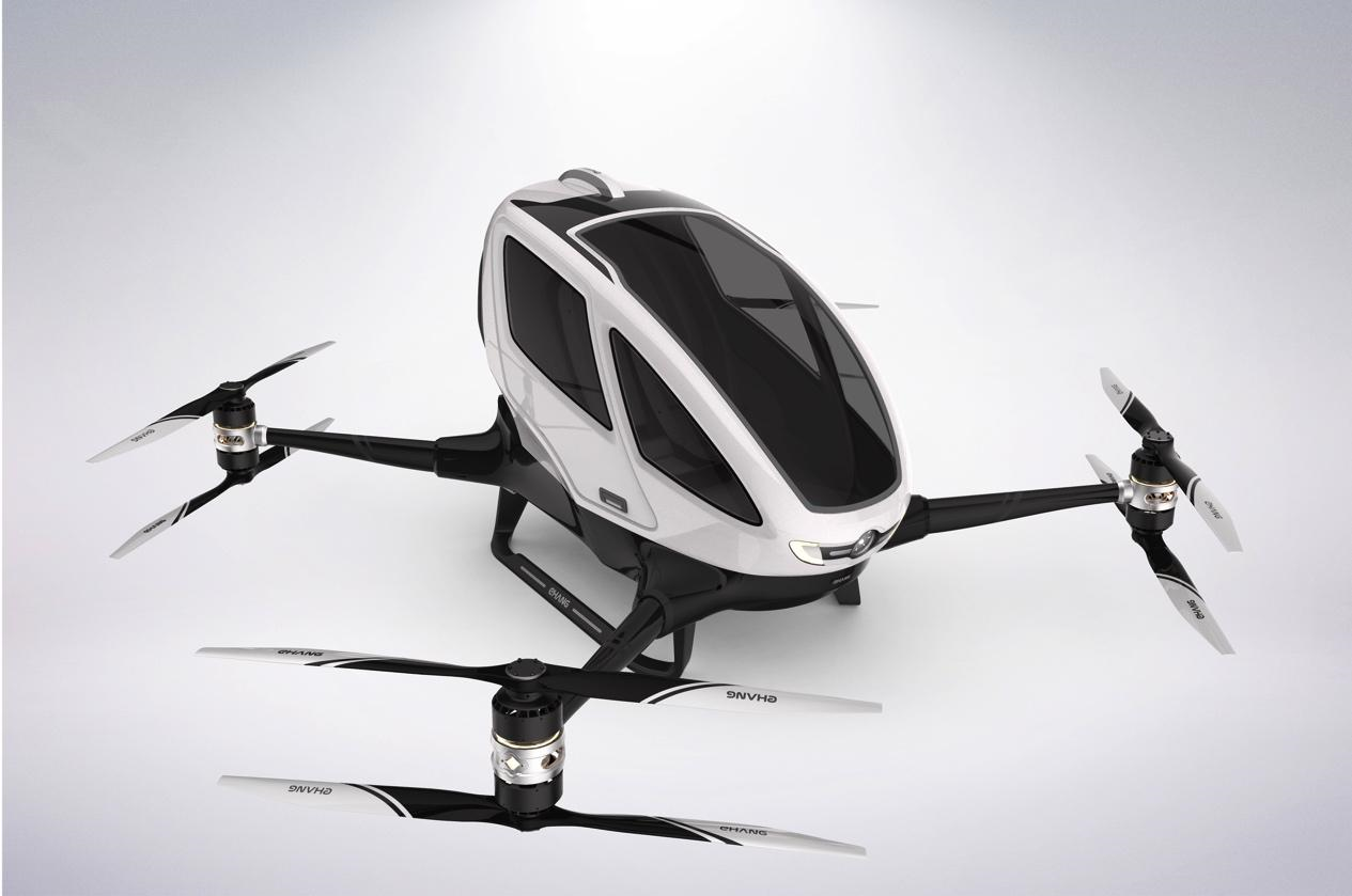
b) Incorporate an element of flight, to tie back to the core tech of drones.
Result:
We are happy with the final design, with the logo is able to stand alone (as on the left), or be used full text with our company name.
As seen below, it is also able to be reversed white on black with ease, without compromising its ability to be recognized.
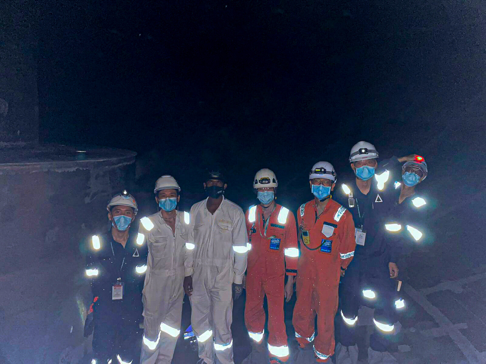
One off-shoot benefit, which was also planned for - was that it allowed us to create company wear with a black based material. Our operations staff travel everywhere, from oil-rigs, to oil plants and bashing through dense vegetation, our previous white colored shirts were quickly stained.
Sharp angles and an almost dagger like shape of the "A" was intended to communicate the aggressiveness to remain at the cutting edge of drone technology.
All well and good you might ask, but where is the element of flight?
See it now?
